With the use of our analytics, user research tools and user insights, REO helped us increase our sales and come up with a winning design through iterative experimentation. The proof of concept design helped us add a commercial ticket value to the project. Their professional, agile and efficient ways of working along with collaboration throughout the testing process is appreciated across the business!
La Redoute
through rate to the
credit application
page
applications
applications being
accepted
account) orders
Our contributions
- CRO
- Experimentation
- Analysis
- Design and UX Recommendations
- Problem solving
- Research strategy
- UX/ UI Design
Tech partners
La Redoute
La Redoute is one of the largest French multi-channel retailers. Established in 1837, they have over 10 million customers worldwide.
Challenges

The aim of the experimentation programme was threefold:
1. Increase credit applications
2. Increase the quality of (Credit) applications
3. Not adversely impact non-credit (Cash) payment journey
The REO approach
Fundamentally for the experimentation to be successful it was important that both payment options (Cash & Credit) were clearly available to La Redoute customers. An initial UX and competitor review highlighted that the “Credit Account” information on the payment page could be improved with:
- Use of icons
- Colour & better contrast
- New page formatting
Armed with this insight, the team at REO put together an iterative experimentation strategy. This approach minimised the risk at such a crucial step of the journey, while allowing REO’s experimentation experts to understand the influence of each and every subtle change. A series of experiments were conducted, each one building on the previous.
Deliverables
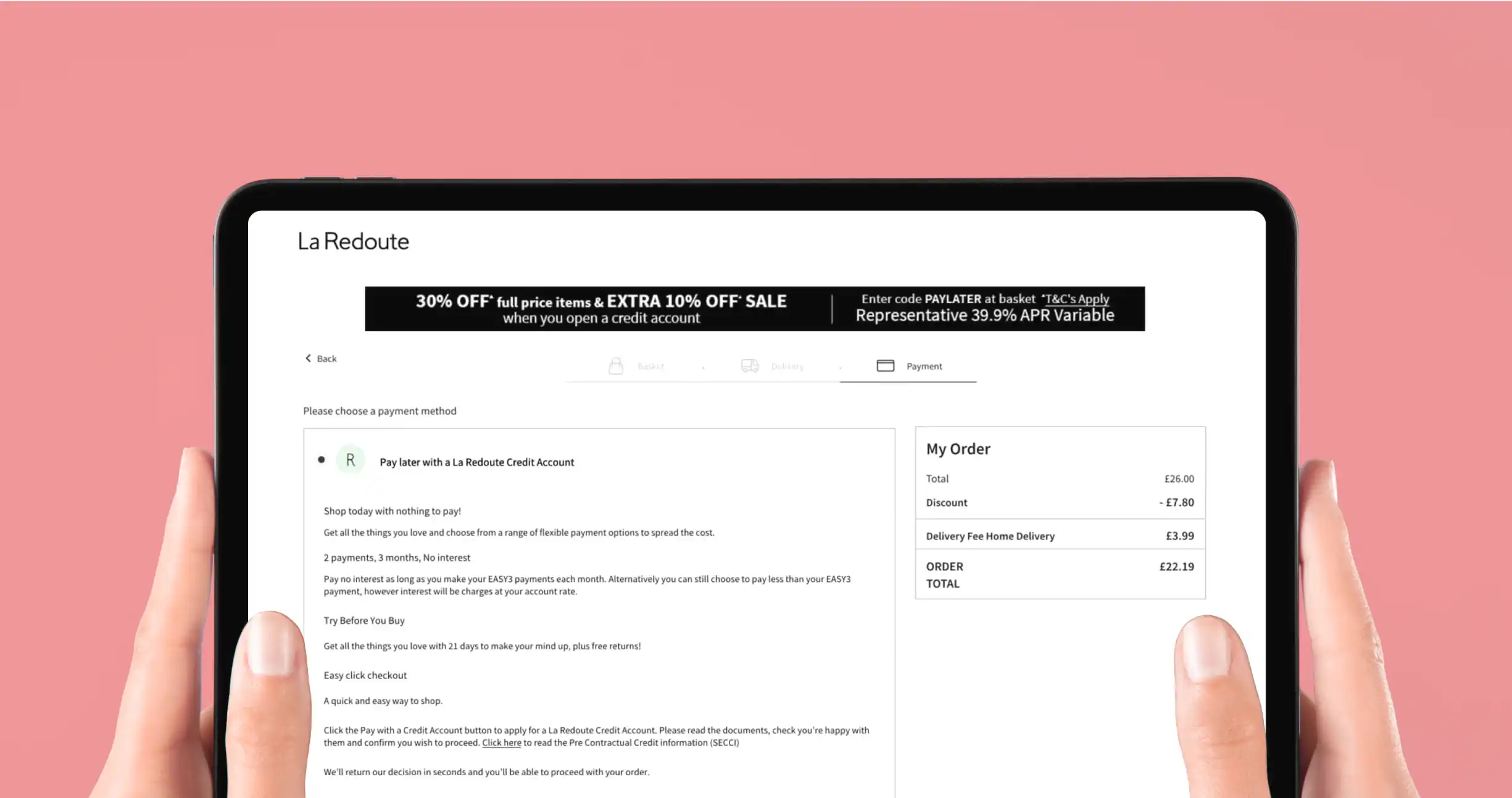
The stepped iterative approach first sought to maintain the current functionality of the credit payment option, allowing the section to expand, offering more information and a more engaging design.
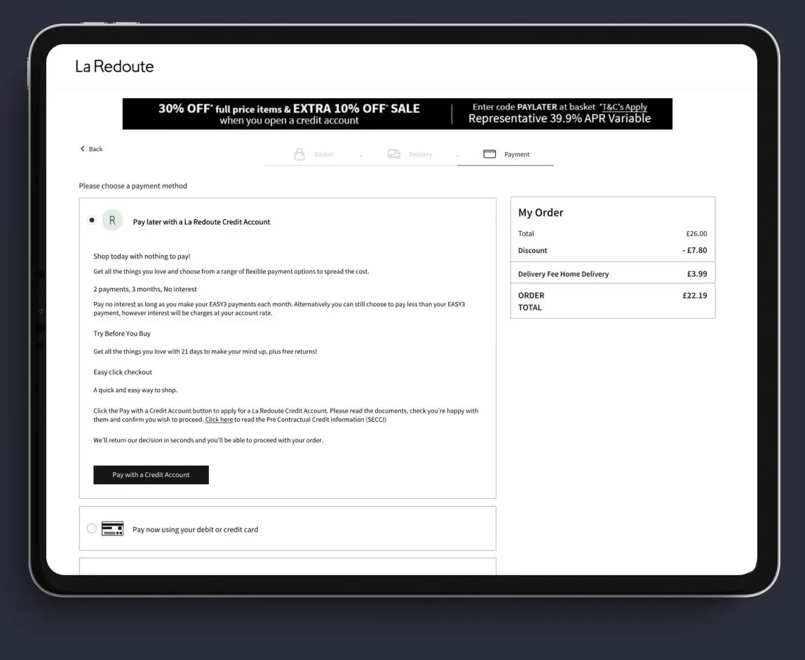
Before
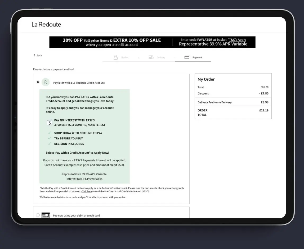
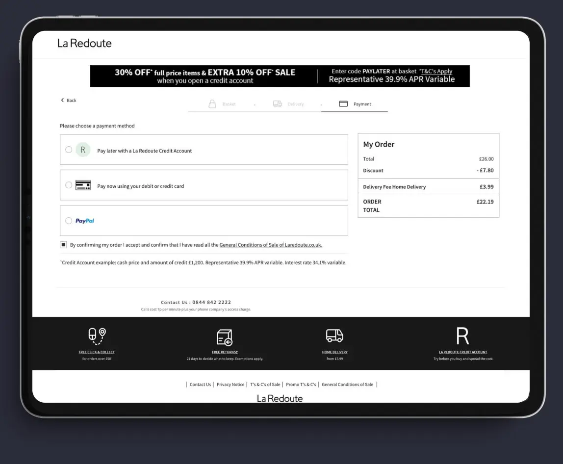
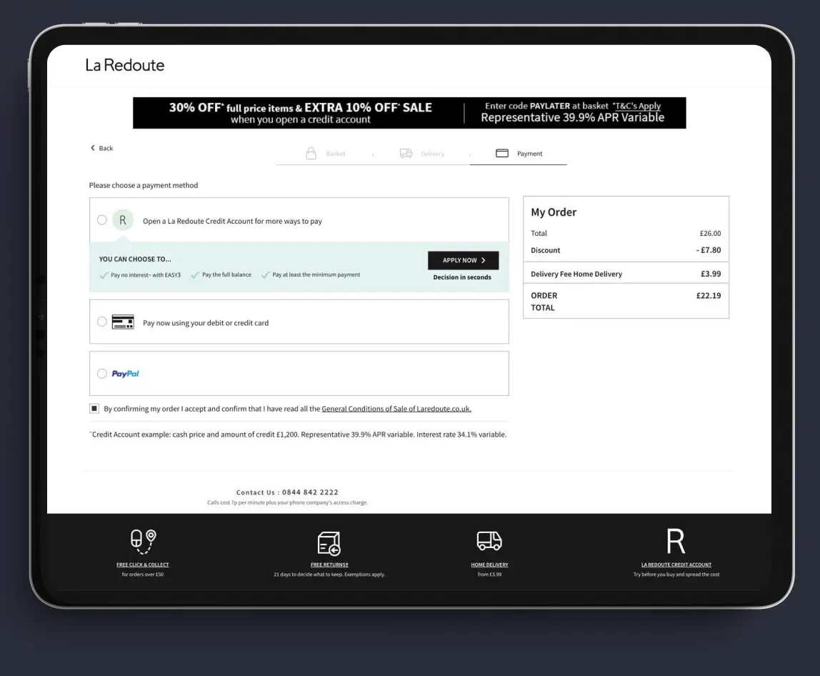
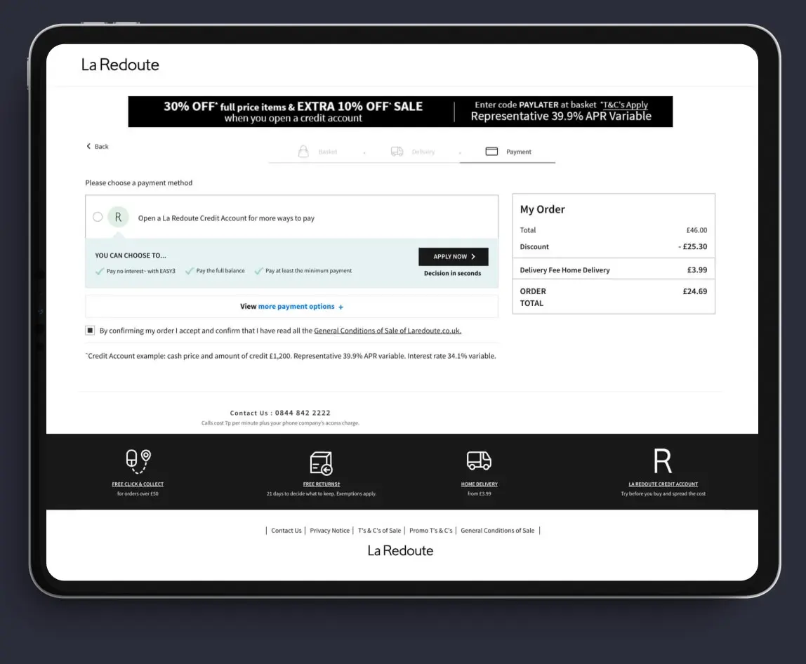
A final iteration was created, again keeping the previous winning variation as the (new) control. Building on the 2 previous experiments, REO’s experimentation team decided to hide the other payment options from the page, with only a discreet link to expand them.

The outcome
The final winning design resulted in:
• 35% increase in click through rate to the credit application page
• 10.3% uplift in credit applications
• 12% increase in credit applications being accepted
• 15% increase in (credit account) orders
• No decline in overall transactions



“This series of 3 iterative experiments took the La Redoute CRO programme from the first maturity stage (Basic CRO) into the second stage (Strategic CRO).
Taking the learnings from a single experiment and using it to inform the future roadmap is a key difference for strategic CRO compared to ad-hoc tests conducted in isolation, which often lead to inconclusive results.“