It goes without saying that the checkout process is critical for conversions.
As the final hurdle between intent and action, it’s crucial to ensure you get people across the line.
There are basic guidelines to follow for any checkout page, along with more detailed heuristics from leading user experience experts.
However, it ultimately takes testing and iteration – supported by these guidelines and heuristics – to reach the optimum layout for your customers.
Not to mention that preferences will change over time, so companies must be prepared to constantly monitor and improve…
What’s coming up?
Let’s take a look at the anatomy of a high-converting checkout process, common issues and a 5-step process which will lead to increased conversions.
Then, we’ll kick-start some ideas for your own experimentation with a few real-world examples from us.
New vs returning customers
Before diving into optimisation strategies, it’s essential to recognise that not all buyers are the same. Two distinct groups require different approaches:
New customers
Focus on building trust and providing clear guidance
Need more detailed information and reassurance
Willing to spend more time in exchange for confidence
Returning customers
Prioritise speed and convenience
Focus less on reassurance – they already trust your brand
Expect a streamlined, friction-free experience
The anatomy of a high-converting checkout process
A high-converting checkout process revolves around three key elements – simplicity, speed and trustworthiness.
Simplicity
A straightforward flow eliminates unnecessary steps. In particular, research reveals that reducing form fields will improve checkout UX by removing confusion.
Optimising by customer type
Making the flow simple requires different steps depending on the customer type:
New customers
Remove all non-essential form fields
Consider making guest checkout the default option
Reduce cognitive load by grouping related fields together logically
Returning customers
Provide one-click checkout options
Enable saved payment methods to reduce fields further
Provide auto-filled forms which only need double-checking
Speed
Every second counts. A slow or overly complex checkout can make customers reconsider their purchase or abandon the process entirely.
Optimising by customer type
Here are some ways to speed up the process, depending on the customer:
New customers
Prominently display the checkout option
Offer progress indicators to prevent drop-off
Provide clear next steps to encourage progression
Returning customers
Offer express checkout paths
Ensure there are minimal clicks to completion
Provide a quick reorder functionality
Trustworthiness
Customers need assurance that their payment information is secure and that there won’t be any hidden surprises, such as unexpected costs.
Optimising by customer type
Trust needs to be displayed differently depending on the customer. First-time buyers need upfront reassurance, while returning customers need easy access to their data.
New customers
Display prominent security badges
Provide detailed shipping information
Showcase clear money-back guarantees
Returning customers
Focus on order history and status updates
Show relevant order history during checkout
Provide quick access to previous shipping options
Applying the key checkout conversion elements
Let’s compare an optimised checkout flow with an unoptimised one to illustrate the impact of these elements.
Optimised flow
- Fewer fields and clear instructions
- Guest checkout option prominently displayed
- Payment options catering to diverse customer needs
- Total costs (including shipping and taxes) displayed upfront
- Mobile-friendly design
- Security badges and payment assurances in visible locations
Unoptimised flow
- Long forms with irrelevant fields
- Mandatory account creation
- Limited payment methods
- Hidden costs revealed late in the process
- Poor mobile usability with tiny buttons and slow load times
- Lack of visual trust signals like SSL or secure payment badges
Common checkout issues
You now understand:
The three key elements which make up an optimal checkout process
How optimised and unoptimised flows present in practice
Now let’s look at the most common checkout issues.
It’s inevitable that a site will experience some drop-off at the checkout stage – but there are some issues which can be resolved, helping you bridge that gap between intent and purchase more frequently and maximise conversions.
To help you brainstorm what your potential issues could be, here are some of the most common ones:
Too many steps
First-time buyers:
Requiring immediate account creation instead of offering guest checkout
Asking for non-essential information like marketing preferences during checkout
Not explaining why certain information is needed
Returning customers:
Having to re-enter saved information
No quick checkout option
Forced to go through all steps when information hasn’t changed
Lack of payment options
First-time buyers:
No clarity on payment security
Missing popular regional payment options
Returning customers:
Saved payment methods not appearing
Having to re-verify saved cards
No quick reorder function with saved payment
Unclear costs
First-time buyers:
Hidden fees revealed late in checkout
Shipping costs not shown until final step
Unclear delivery timeframes
Returning customers:
Changed shipping rates from previous orders not highlighted
No quick view of total cost with saved shipping preference
Previous discounts or loyalty rewards not automatically applied
Poor mobile experience
First-time buyers:
Complex forms not optimised for mobile input
Security badges and trust signals hard to see on mobile
Difficult to enter new information on small screens
Returning customers:
Saved information hard to select on mobile
Quick checkout buttons too small or poorly placed
Payment selection interface not mobile-friendly
Lack of progress indicators
First-time buyers:
No clear indication of checkout stages
Unclear how much information is needed
No estimated time to complete checkout
Returning customers:
No indication of how many steps can be skipped
Unclear which information is already saved
No quick view of remaining required actions
Lack of trust signals
First-time buyers:
Missing security badges and certifications
No clear return policy or guarantee
Limited customer reviews or social proof
Returning customers:
Previous purchase history not visible
Loyalty status not acknowledged
Insufficient shipping information
First-time buyers:
Delivery options not shown until late in checkout
No explanation of shipping methods
Unclear delivery timeframes
Returning customers:
Previous shipping preferences not pre-selected
No quick selection of past delivery addresses
Poor accessibility
First-time buyers:
Form fields not properly labeled for screen readers
Confusing navigation for keyboard users
Error messages not properly announced
Returning customers:
Saved information not accessible via keyboard
Quick checkout options not properly announced
Status updates not conveyed to screen readers
Lack of personalisation
First-time buyers:
Generic checkout experience
No smart defaults based on location
Irrelevant upsell suggestions
Returning customers:
Previous preferences not remembered
Purchase history not used for recommendations
No personalised shipping or payment defaults
Summary
First-time buyers need:
Clear guidance and explanation
Strong trust signals
Simplified but informative process
Returning customers need:
Speed and efficiency
Recognition of their status
Quick access to saved preferences
5 steps to optimise your checkout process
By this point, you should have a good understanding of:
The key elements which contribute to an optimised checkout process
How these elements can be applied in practice to create an optimised flow
An overview of the most common checkout issues and the frustrations which arise
Let’s now look at the basic building blocks you can use to build an optimised checkout process. It’s worth examining each of these steps regularly, for two reasons:
Companies undergo website changes which may inadvertently impact the checkout flow
Processes designed internally may not be optimally servicing the end-user
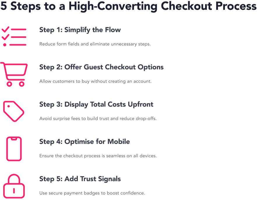
Simplify the flow
Eliminate unnecessary fields and combine related information (e.g., shipping and billing addresses).
New customers
Remove all non-essential form fields
Provide clear field labels and formatting examples
Show helpful tooltips for complex fields
Returning customers
Pre-fill forms with saved data
Enable one-click address selection
Allow quick edits of existing information
Application in practice
- Analyse quantitative data to discover the precise point of drop-off on a form.
- Conduct user testing to identify which fields are superfluous and deterring customers from checking out.
Offer guest checkout options
Avoid forcing account creation. Allow users to check out as guests, with the option to create an account later.
New customers
Make guest checkout the default option
Explain benefits of account creation post-purchase
Provide clear path to optional registration
Returning customers
Enable quick account recognition
Offer express checkout option
Keep users logged in across devices (with their permission)
Application in practice
- Track guest vs account checkout conversions.
- Monitor post-purchase account creation rates.
- Analyse return user recognition accuracy
Display total costs upfront
Be transparent about all costs, including taxes and shipping, before the payment stage.
New customers
Show complete cost breakdown early
Explain shipping calculation method
Highlight available payment options
Returning customers
Apply saved shipping preferences automatically
Display available loyalty rewards
Application in practice
- Find out where people abandon after seeing costs.
- Test different ways of showing the total price.
- Check if returning customers use their saved shipping options.
Optimise for mobile devices
New customers
Provide large, clear form fields
Implement mobile-friendly data entry
Returning customers
Enable touch-friendly express checkout
Provide quick access to saved payment methods
Simplify order review process
Application in practice
- Compare mobile conversion rates by user type.
- Monitor express checkout usage on mobile.
- Test content hierarchy and element prioritisation on mobile.
Add trust signals
Include visible security badges, SSL certification icons, and clear refund or return policies to reassure customers about their purchase.
New customers
Display security badges prominently
Show customer reviews and ratings
Provide clear return policy information
Returning customers
Highlight order history
Show loyalty status
Application in practice
- Track interaction with trust elements.
- Test security indicator placement.
- Analyse impact of showing order history.
Checkout optimisation: real-life examples
You may have guessed by now that optimising a checkout process takes more than following best practices and general guidelines if you want to maximise conversions.
Conducting bespoke testing with CRO experts who have extensive industry experience enables your brand to develop a culture of experimentation and build a comprehensive programme that impacts all stages of the buyer journey, including the checkout.
Here are some real-world examples of checkout optimisation performed by our specialists, here at REO:
Checkout redesign
We identified a high drop-off rate on the sign-in page of a checkout process for an e-commerce site. By balancing visibility between options for new and returning customers, the updated design increased progression to the shipping page. While transactions initially dipped, the test ultimately led to improved revenue and a higher overall transaction count.
Sticky checkout button
To streamline the mobile shopping experience, we surfaced key information on the basket page and introduced a sticky checkout button. This change resulted in more completed transactions and increased use of alternative payment methods like PayPal and Apple Pay.
Order summary optimisation
We reorganised the content hierarchy on the basket’s order summary to make key decision-making details more accessible. This approach reduced friction during checkout, increased average order value (AOV), and encouraged quicker purchase completions.